Contents
Introduction
In this coursework, principal component analysis is used to separate a very high dimensional medical dataset of ~ 20,000 genes as input features and 5 type of tumor as output features. The dataset consists of ~ 800 patients. The aim is to predict the type of tumor by considering the gene expression levels. PCA is used to determine the linear combination of gene expression levels that separate the 5 type of tumors mostly.
PCA
Principal component analysis is a process to find i orthonormal principal component vectors for a collection of N datapoints in RD and then use the principal component vectors to perform a change of basis on the data.
 This figure shows the two principal components of a randomly generated 2D gaussian distribution.
PCA is generally used as dimensionality reduction for visualizing high dimension dataset or to save storage space by limiting the number of the principal components dimensions.
However, here we use the property of which the first principal component is a direction that maximizes the variance of the projected data. The ith principal component can be taken as a direction orthogonal to the first i−1 principal components that maximizes the variance of the projected data. Therefore, by finding the most variation in the data the PCA could find the linear combinations that best separate the data.
Mathematically, the first principal component vector w1, such that the data projected onto this vector has the largest variance, i.e.
w1=argmaxwN∑i(Xi⋅w)2
where Xi is the vector corresponding to the attributes of patient i. This is equivalent to maximise
wXTXw
which is achieved by the eigenvector of XTX with the largest eigenvalue. The second principal component vector will be the eigenvector with the second largest eigenvalue, etc.
The data requires to be normalised before performing PCA, i.e. subtract the mean value from each attribute divide each attribute with the variance to make a unity variance. If mean subtraction is not performed, the first principal component might instead correspond more or less to the mean of the data. Additionally, a unity variance make the data vary in a limited and normalised range which is desireable for PCA.
Gene expression
Gene expression is the process by which information from a gene is used in the synthesis of a functional gene product that enables it to produce protein as the end product. These products are often proteins, but in non-protein-coding genes such as transfer RNA (tRNA) or small nuclear RNA (snRNA) genes, the product is a functional RNA. Since cancer can be described as a disease of altered gene expression, we are interested to find the correlation between the various gene expression level and different types of tumour.
Possible extension
-
Apply factor analysis to determine which types of gene expression levels correlates to which type of tumor mostly.
-
Logistic regression model or a shallow neural network can be trained to predict the type of tumor new patient might have with input gene expression levels. This can be done before or after principal component analysis which act as dimensionality reduction here. However, the dataset does not give a class of normal patients (without any tumor) which makes this prediction quite weak.
Dataset normalisation and overview:
gene expression cancer RNA-Seq Data Set
The dataset can be downloaded here.
Source:
Samuele Fiorini, samuele.fiorini ‘@’ dibris.unige.it, University of Genoa, redistributed under Creative Commons license (http://creativecommons.org/licenses/by/3.0/legalcode) from https://www.synapse.org/#!Synapse:syn4301332.
Data Set Information:
Samples (instances) are stored row-wise. Variables (attributes) of each sample are RNA-Seq gene expression levels measured by illumina HiSeq platform.
Import Dataset
1
2
3
4
5
import numpy as np
X = np.genfromtxt('cancer-gene-data2.csv', delimiter=',')
tumor = np.genfromtxt('cancer-gene-labels.csv', delimiter=',')
print(X.shape)
print(tumor.shape)
X.shape: (801, 10266)
tumor.shape: (801,)
As we can see, X is a matrix of 801 by 10266, where there are 801 rows of different patients and 10266 columns of genes entries. Additionally, tumor is a numpy array that stores the type of tumor each patient has. Labeled from 1-5 that corresponds to BRCA, KIRC, COAD, LUAD and PRAD respectively.
Print out first 10 entries in tumor array by calling tumor[:10]:
array([1., 2., 1., 1., 3., 1., 4., 1., 3., 1.])
Data Visualization
Firstly, collect the index of patient for each type of tumor into an array.
1
2
3
4
5
t1 = [index for index,value in enumerate(tumor) if value == 1]
t2 = [index for index,value in enumerate(tumor) if value == 2]
t3 = [index for index,value in enumerate(tumor) if value == 3]
t4 = [index for index,value in enumerate(tumor) if value == 4]
t5 = [index for index,value in enumerate(tumor) if value == 5]
Print the number of samples for each type of tumor:
| Type of Tumor | No. of Samples |
|---|---|
| 1. BRCA | 136 |
| 2. KIRC | 141 |
| 3. COAD | 300 |
| 4. LUAD | 146 |
| 5. PRAD | 78 |
| Sum | 801 |
The samples are spread reasonably evenly since there is no normal sample in this dataset. However, imbalanced dataset are quite common in medical datasets as the number of normal patients would always surpass patients with conditions. Therefore, always check for balance of data before apply any machine learning algorithms.
Plot some scatter plots:
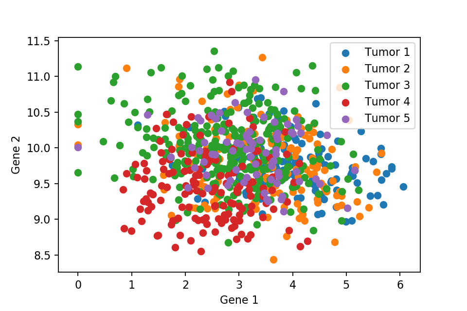 A 2D scatter plot with respect to first and second gene expression level.
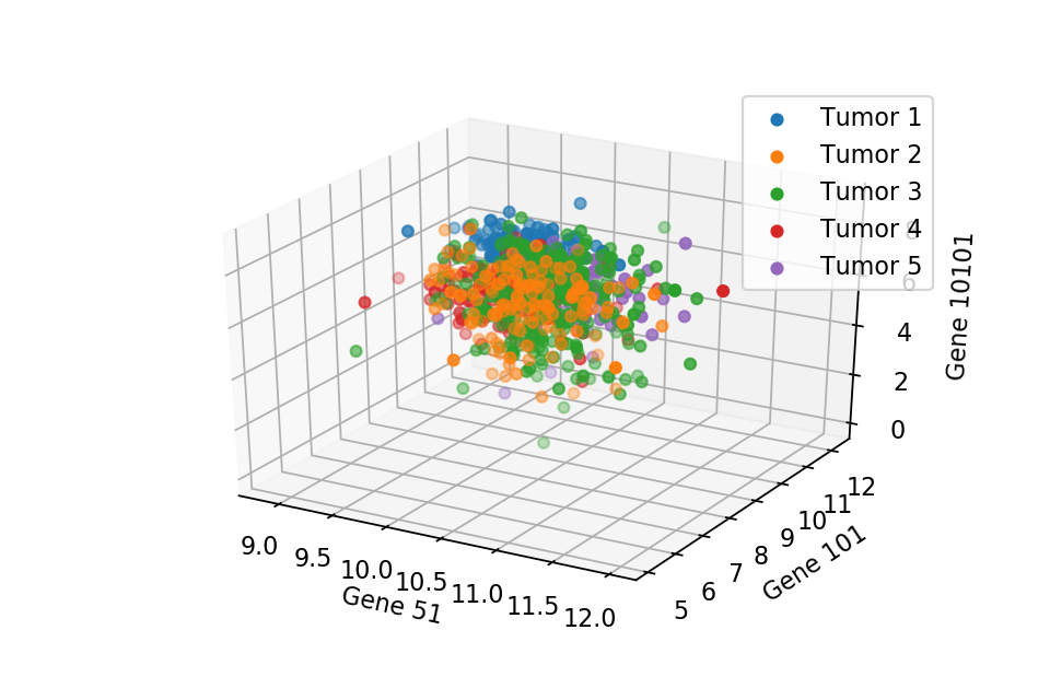 A 3D scatter plot with respect to 3 random chosen gene expression level.
These two scatter plots show that we can not separate the 5 types of tumor, where they are all just overlapped with each other. Therefore, PCA comes into play to separate the tumors cleanly. But first we need to normalise the data.
Helper Function for normalising the dataset
We define the following helper function to normalise the dataset.
1
2
3
4
5
6
7
8
9
10
11
12
13
14
15
16
17
18
19
20
21
22
23
def normalise(x):
    ndata, ndim = x.shape
    # obtain the number of rows and columns

    m = x.sum(axis=0)
    # compute the mean along each column into a vector

    x0 = x - m[np.newaxis,:]/ndata
    # subtract the mean divided by the number of rows from each element
    # the "np.newaxis" construct creates identical rows from the same mean value

    s = np.sqrt((x0**2).sum(axis=0)/ndata)
    # now compute the standard deviation of each column

    ss = np.array([ tmp if tmp != 0 else 1 for tmp in s])
    # if the standard deviation is zero, replace it with 1
    # to avoid division by zero error

    x00 = x0 / ss[np.newaxis,:]
    # divide each element by the corresponding standard deviation

    return x00
    # return the normalised data matrix
Then we apply the helping function to normalise the input features: X0 = normalise(X)
Print the mean and variance for checking:
- Mean:
X0.mean()-1.351152313569359e-16 - Variance:
X0.var()0.986460159750634
mean and variance are reasonably close to 0 and 1 respectively.
PCA
After normalising the data we can proceed to PCA. Recall that PCA requires eigenvalue and eigenvectors of XTX. However, here this matrix would be super expensive to compute. To bypass this, we find the singular value decomposition (SVD) of X0: U,s,V = np.linalg.svd(X0).
V would be a 10266 * 10266 matrix and each row corresponds to a eigenvector of X0. Furthermore, SVD would guarantee that the first row of the matrix is the eigenvector corresponds to the largest eigenvalue. The second row corresponds to the second largest eigenvalue, etc.
Therefore, we can then project X0 onto the principal directions by simple vector dot product, here we only considered the first 4 principal direction for the ease of analysis.
1
2
3
4
5
# Compute the first four most principal components
X1 = np.matmul(X0,V[0])
X2 = np.matmul(X0,V[1])
X3 = np.matmul(X0,V[2])
X4 = np.matmul(X0,V[3])
PCA Visualization
Here we plot one 3D plots of first three principal components and several 2D plots of the combinations of the first four principal components.
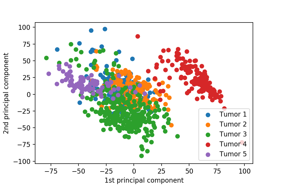
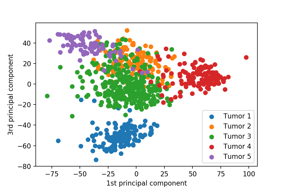
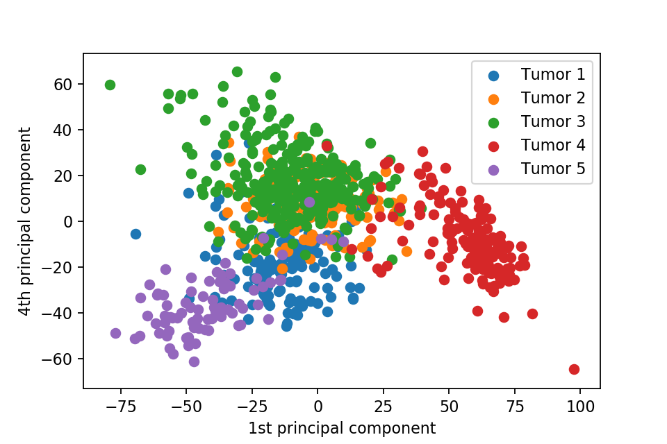
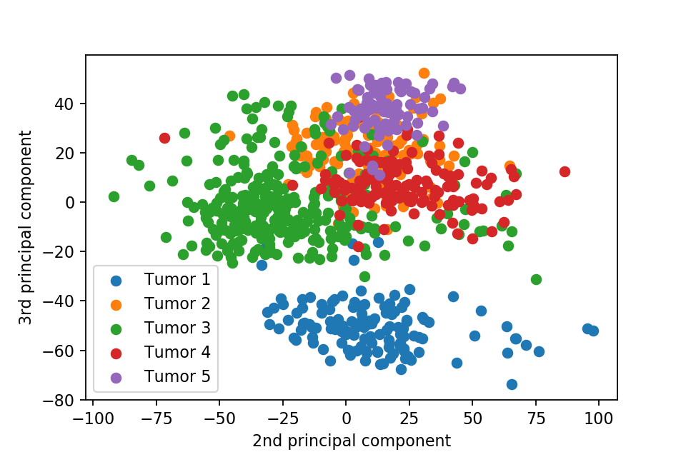
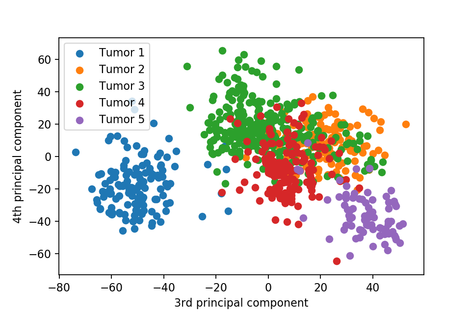
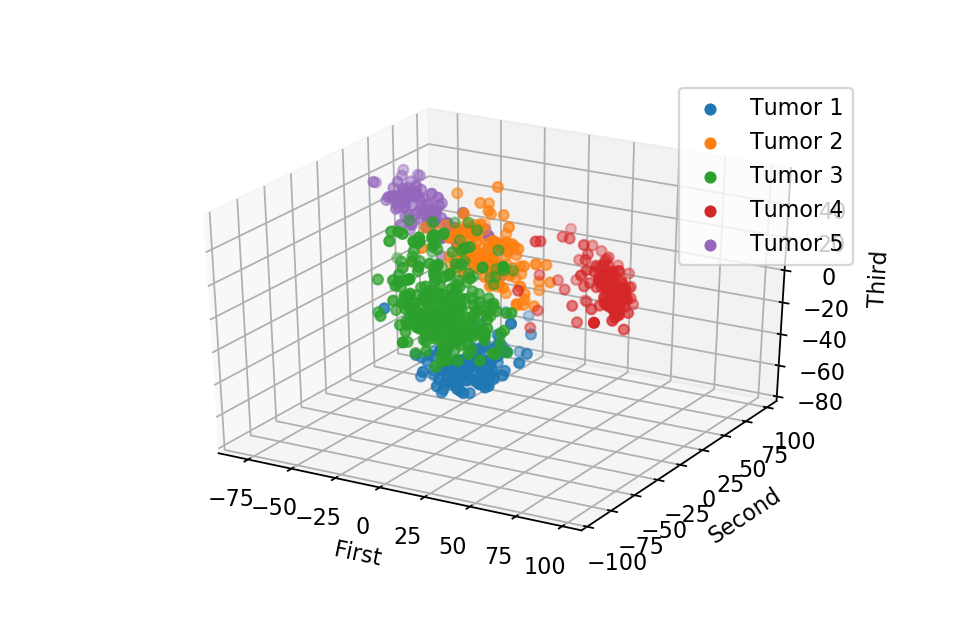
We can clearly see that the separation of the data points becomes much clearer. Furthermore, we can draw some decision boundary to classify between deferent type of tumor.
Comments